Version info
Version 2.2 - Release 23.07
1. Detailed component descriptions
This guide describes the basic html elements in detail, including global components and specific CSS rules used for browser compatibility.
A merchant specific stylesheet should only contain the elements that needs to be changed. Remaining elements will be styled according to the Market Pay Gateway Hosted Wallet Page default stylesheet.
1.1. Global components
Each section contains a screenshot of the specific element, its description, and the most relevant CSS.
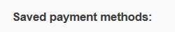
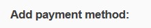
1.1.1 .savedWalletHeader, .walletSelectionHeader
.png "image(7).png")
.savedWalletHeader – used as header for saved payment methods in the wallet.
.savedWalletHeader {
    color: #3e3e3e;
    font-size: 110%;
    font-weight: bold;
    margin-left: 15px;
    margin-bottom: .833em;
    padding-top: 1.875em;
}
.png "image(8).png")
.walletSelectionHeader – used as header for available payment methods which can be added to the wallet.
.walletSelectionHeader {
color: #3e3e3e;
font-size: 110%;
font-weight: bold;
margin: 1.875em 0 .833em 1.6em;
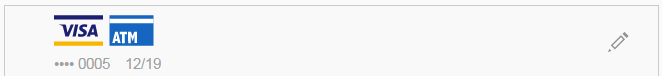
}1.1.2 .walletItem
.png "image(9).png")
.walletItem – used as the main container for saved payment method.
.walletItem {
    display: block;
    width: 100%;
    position: relative;
    border-top: 1px solid #cacaca;
    overflow: hidden;
    background-color: #f9f9f9;
}
.infoHolder – used as a container for the saved payments logo and additional information.
.walletItem .infoHolder {
    display: inline-block;
    color: #9a9a9a;
    margin-left: 2em;
    padding-bottom: .417em;
}
.buttonHolder.edit – holds the edit button for the saved payments method.
.walletItem .buttonHolder.edit {
cursor: pointer;
display: inline-block;
float: right;
line-height: 0;
margin: 1.5em .5em 0 0;
text-align: center;
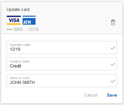
}1.1.3 .instrument.saved
.png "image(10).png")
.instrument.saved – used as a container for edit saved payment method form. It is also used as an overlay behind edit form popup. Additional classes active, animate added if form is open.
.instrument.saved {
    overflow-y: hidden;
    width: 100%;
    z-index: 10;
    display: none;
    position: fixed;
}

.instrument.active.saved {
    height: auto;
    top: 0;
    height: 100%;
    width: 100%;
    background-color: rgba(255,255,255,0.5);
    right: 0;
    bottom: 0;
    display: block;
    z-index: 99999;
}

.instrument.animate {
    -webkit-transition: height .5s;
    -moz-transition: height .5s;
    transition: height .5s;
}
.content – used for the actual form popup to be seen on the overlay (.instrument.saved).
.instrument .content {
    background-color: white;
    max-width: 80%;
    width: 28em;
    margin: 2em auto;
    border: 1px solid #cacaca;
    border-radius: 2px;
    box-shadow: 0 2px 10px 0 rgba(0,0,0,0.15);
}
.instrumentPopupHeader – used to define the edit form popup header.
.instrumentPopupHeader {
    color: #3e3e3e;
    background-color: #f9f9f9;
    margin-bottom: .333em;
    display: block;
    padding: 1.25em;
    padding-bottom: .5em;
    border-bottom: 1px solid #cacaca;
}
.instrumentPopupContent – used as the container for the main content.
.instrumentPopupContent {
padding: 1.25em;
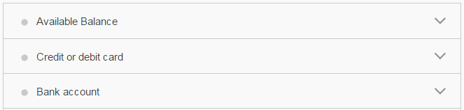
}1.1.4 .walletHeader
.png "image(17).png")
.walletHeader – used as the header for the payment methods accordion.
.walletHeader {
    background-color: #f9f9f9;
    height: 3.286em;
    line-height: 3.286em;
    width: 100%;
    vertical-align: middle;
    border-top: 1px solid #cacaca;
    color: #3e3e3e;
}
.iconHolder – holds the circle icon on the left.
.walletHeader .iconHolder {
    width: 2.857em;
    min-width: 2.857em;
    display: inline-block;
    vertical-align: middle;
    height: 100%;
}
.textHolder – holds the payment method title text.
.walletHeader .textHolder {
    color: #3e3e3e;
    vertical-align: middle;
    display: inline-block;
    height: 100%;
}
.buttonHolder – holds an arrow icon on the right.
.walletHeader .buttonHolder {
    border-left: none;
    color: #fff;
    margin-top: -1px;
    width: 2.857em;
    min-width: 2.857em;
    display: inline-block;
    vertical-align: middle;
    height: 100%;
    float: right;
}
1.1.5 .cardLogoHolder

.png "image(12).png")
.cardLogoHolder – used for holding available credit card and 3D security logos.
.cardLogoHolder {
margin-bottom: 0.833em;
    	width: 100%;
    	display: inline-block;
    	box-sizing: border-box;
}
.securityLogoHolder – used for holding available credit card 3D security logos.
.securitylogoHolder {
	display: inline-block;
    	float: right;
}
1.1.6 .inputContainer
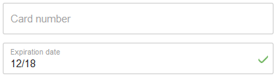
.png "image(14).png")
In this example we will use the Card Number Input.
.inputContainer – used for almost any kind of input: text, number, select and auto-complete.
Every input container has an additional class to specify nature of the input. In this example – .cardNumberInput. Additional class active added if the input is focused.
.inputContainer {
    box-sizing: border-box;
    display: table;
    font-size: 1em;
    height: 3em;
    border: 1px solid #cacaca;
    border-radius: 2px;
    position: relative;
    width: 100%;
    margin-bottom: .833em;
    padding-right: 0;
    padding-left: .714em;
    padding-right: 1.428em;
    background-color: white;
    -webkit-transition: border .2s ease-out;
    -moz-transition: border .2s ease-out;
    transition: border .2s ease-out;
}
CardNumberInput InputCointainer – consists of:
.labelContainer – which moves to the top left corner when you add classes .filled and .animated to the .inputContainer.
.inputContainer .labelContainer {
    color: #a0a0a0;
    display: block;
    margin-top: 1em;
    position: absolute;
}

.inputContainer.filled .labelContainer {
    font-size: 75%;
    color: #a0a0a0;
    opacity: 0;
}
.inputContainer.filled.animated .labelContainer {
opacity: 1;
margin-top: .6em;
transition-property: opacity,margin-top;
transition-duration: .1s;
transition-timing-function: ease;
transition-delay: 0s;
}input – which is type="tel" to allow only numbers.
.inputContainer input {
    border: medium none;
    color: #cbcbcb;
    display: table-cell;
    font-size: inherit;
    height: 1.4em;
    padding-top: .632em;
    width: 97%;
    background-color: transparent;
    padding-left: 0;
    transition: padding-top .2s ease-out;
    -webkit-transition: padding-top .2s ease-out;
    -moz-transition: padding-top .2s ease-out;
}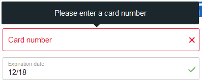
.errorMsg – used to store error messages. An additional class .error is added to the .inputContainer, to indicate the incorrect information. The error message is displayed as a tooltip.
.inputContainer + .errorMsg {
    position: absolute;
    color: white;
    background-color: #1c272d;
    border-radius: 2px;
    padding: 1em;
    width: 23.833em;
    z-index: 2000;
    -ms-transform: translate(-90%,0);
    -webkit-transform: translate(-90%,0);
    transform: translate(-90%,0);
    display: none;
    text-align: center;
    left: 278px;
    bottom: 42px;
}
.inputContainer.error {
border-color: #e71d32;
}.inputContainer.error:before, .inputContainer.error:after – used to draw an X sign on error in the .inputContainer.
.inputContainer.error:before {
    -webkit-transform: rotate(-45deg);
    -ms-transform: rotate(45deg);
    transform: rotate(-45deg);
}

.inputContainer.error:after, .inputContainer.error:before {
    content: '';
    position: absolute;
    border: 1px solid #e71d32;
    border-radius: 2px;
    width: 10px;
    right: 6px;
    top: 50%;
}

.inputContainer.error::after {
    -webkit-transform: rotate(45deg);
    -ms-transform: rotate(45deg);
    transform: rotate(45deg);
}
.inputContainer.valid:after – used to draw a check sign if the input contents is valid.
.inputContainer.valid::after {
    content: '';
    position: absolute;
    width: 10px;
    height: 5px;
    border: 2px solid #6fb55f;
    border-radius: 2px;
    border-top: 0;
    border-right: 0;
    -webkit-transform: rotate(-45deg);
    -ms-transform: rotate(-45deg);
    transform: rotate(-45deg);
    right: 6px;
    top: 40%;
}
1.1.7 .dialogBox
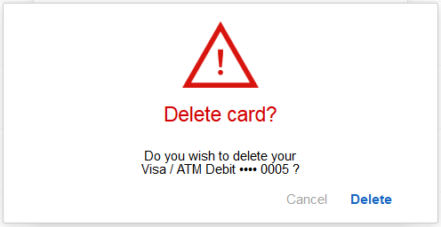
.png "image(1).png")
.dialogBox – used as a container for popups on the site. It is also used as an overlay behind the popup. Additional classes active, animate added if popup is open.
.dialogBox {
    position: fixed;
    top: 0;
    right: 0;
    bottom: 0;
    left: 0;
    z-index: 99999;
    opacity: 0;
    background-color: rgba(255,255,255,0.5);
    -webkit-transition: opacity .3s ease-in-out;
    -moz-transition: opacity .3s ease-in-out;
    -o-transition: opacity .3s ease-in-out;
    -ms-transition: opacity .3s ease-in-out;
    transition: opacity .3s ease-in-out;
    pointer-events: none;
    text-align: left;
    display: none;
}
.dialogBoxBody – used for the actual popup to be seen on the overlay (.dialogBox)
.dialogBox .dialogBoxBody {
    background-color: white;
    max-width: 80%;
    width: 28em;
    margin: 2em auto;
    border: 1px solid #cacaca;
    border-radius: 2px;
    box-shadow: 0 2px 10px 0 rgba(0,0,0,0.15);
    padding: 1.25em;
}
.dialogText – used as the container for the main content.
.buttonContainer – contains popup action buttons and acts as a footer.
For convenience every popup has a unique class:
.confirmDialog.confirmDeleteDialog.redeemDialog
1.1.8 .fancySelect, .selectList
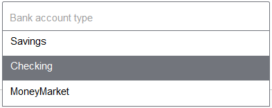
.png "image(16).png")
This is a custom <select> component. It consist of:
.inputContainer – see the description in 1.1.6 .inputContainer paragraph. Additional class fancySelect is added.
.inputContainer.fancySelect {
    margin-bottom: .833em;
}
.selectList – which is the main container for the select options.
.selectList {
    position: absolute;
    background: no-repeat #fff;
    display: block;
    width: 100%;
    max-height: 250px;
    z-index: 1200;
    overflow-y: visible;
    left: 190px;
    border: 1px solid #72757c;
}
1.1.9 .commandButton
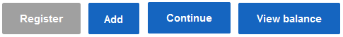
.commandButton – used for all buttons who submits the form.
.commandButton {
    background-color: #1565c0;
    border: 1px solid #1565c0;
    border-radius: 2px;
    box-sizing: border-box;
    color: white;
    cursor: pointer;
    display: inline-block;
    font-size: 1em;
    font-weight: bold;
    height: 3em;
    line-height: 3em;
    padding: 0 1.428em;
    text-decoration: none;
    vertical-align: middle;
}

.commandButton:hover {
    background-color: #013a71;
    border-color: #013a71;
}
1.1.10 CSS reset
This section contains a set of CSS rules that resets the styling of most HTML elements to a consistent baseline, since every browser has its own default 'user agent' stylesheet, used to make unstyled websites appear more legible.
html, body, div, span, iframe, h1, h2, h3, h4, h5, h6, p, a, em, img,
    ins, b, u, i, center, dl, dt, dd, ol, ul, li, fieldset, form, label,
    legend, table, caption, tbody, tfoot, thead, tr, th, td {
    margin: 0;
    padding: 0px;
    border: 0;
    font-size: 100%;
    font: inherit;
    vertical-align: baseline;
}
body {
    line-height: 1;
    position: relative;
    font-size: 14px;
}
body.inFrame {
    overflow-y: hidden;
}
body, button, input {
    font-family: Helvetica Neue, Helvetica, Arial, sans-serif;
}
ol, ul {
    list-style: none;
}
table {
    border-collapse: collapse;
    border-spacing: 0;
}
input {
    outline: none;
}
input:disabled {
    background-color: #FFFFFF;
}
input:focus, textarea:focus, select:focus {
    outline: none;
    -webkit-tap-highlight-color: rgba(255, 255, 255, 0);
    -webkit-tap-highlight-color: transparent;
}